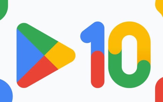
Google Play celebrates its 10th anniversary by launching a new logo. The new logo for Google Play is similar to the older one but has some tweaks. The most visible changes comprise the toning down of the three colors. The new colors match the overall color palette used by Google for its other services. The subtle modifications released on Google’s 10th anniversary are in the green, blue, yellow, and red hues that complement the recently changed Google Chrome logo.
The New Logo Launched on Google’s 10th Anniversary Better Reflects the Magic of Google
Tian Lim, VP of Google Play says, “We’re introducing a new logo that better reflects the magic of Google and matches the branding shared by many of our helpful products — Search, Assistant, Photos, Gmail, and more”. The 10th anniversary celebration of “2.5 billion people in over 190 countries” that use the services provided by Google Play. To mark the day, Google is also offering a 10x boost to Google Play Points.
Users Can Soon Purchase Top-Ups in the App When Their Prepaid App Subscriptions Run Out
In addition to the 10th anniversary celebration, Google Play is working to allow developers to offer users the ability to subscribe via prepaid app subscriptions that essentially provide access to an app and its services for a fixed amount of time the developer sets. This would allow the users to purchase top-ups in the app when their prepaid app subscriptions ran out and they had the funds to continue.
Read more: Google Play Launches Prepaid App Subscriptions to Target Emerging Markets


